Chapter 18 Parameter Estimation
In this chapter, we move beyond
18.1 Normal Distribution
The
More details for the
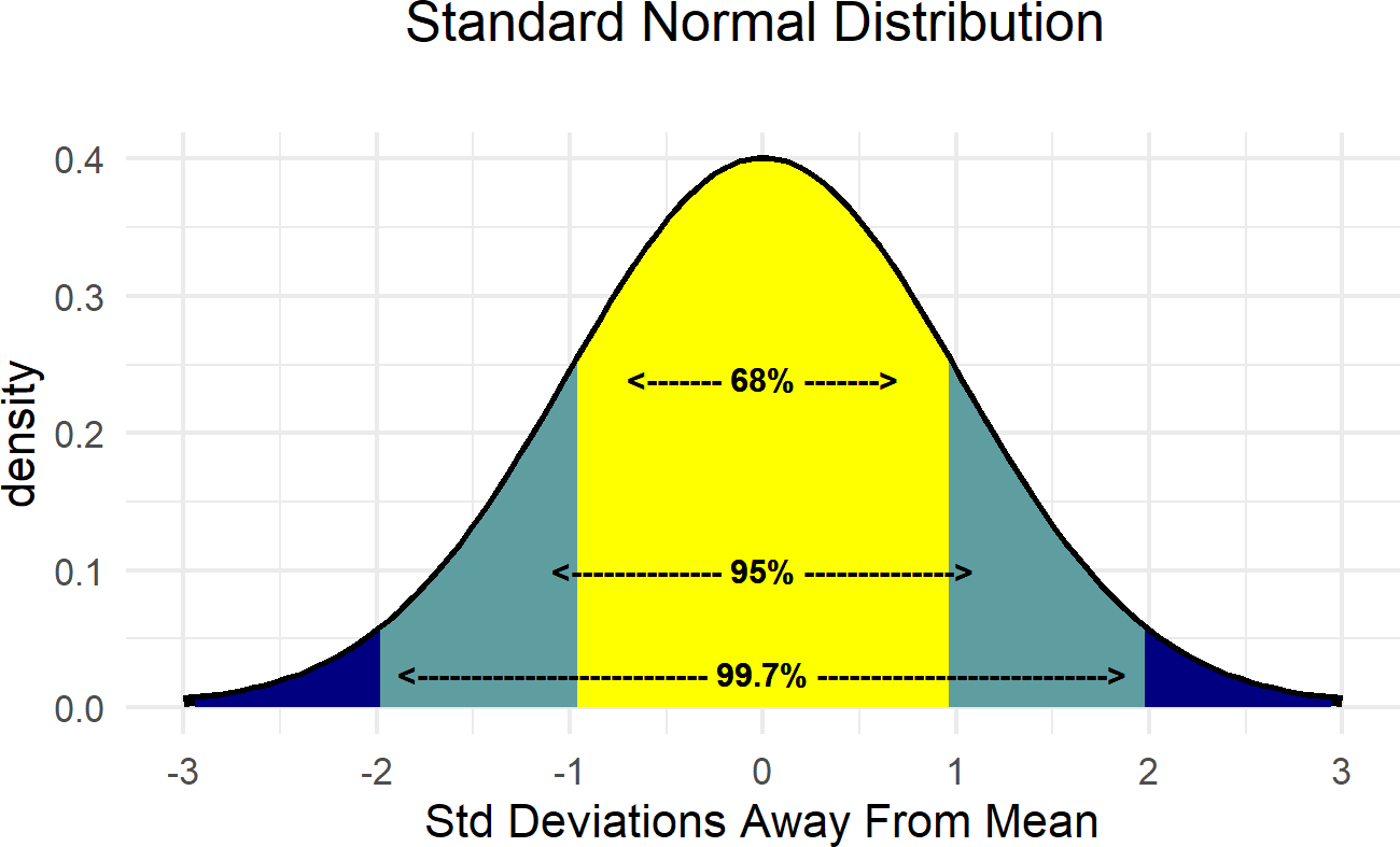 Figure 18.1: Demonstrating the relationship between the standard deviation and the mean of the normal distribution.
There is an astounding amount of data in the world that appears to be normally distributed. Here are some examples:
- Finance: Changes in the logarithm of exchange rates, price indices, and stock market indices are assumed normal
- Testing: Standardized test scores (e.g. IQ, SAT Scores)
- Biology: Heights of males in the united states
- Physics: Density of an electron cloud is 1s state.
- Manufacturing: Height of a scooter’s steering support
- Inventory Control: Demand for chicken noodle soup from a distribution center
Due to its prevalance and some nice mathematical properties, this is often the distribution you learn the most about in a statistics course. For us, it is often a good distribution when data or uncertainty is characterized by diminishing probability as potential realizations get further away from the mean. Given the small probability given to outliers, this is not the best distribution to use (at least by itself) if data far from the mean are expected. Even though mathematical theory tells us the support of the
Here is just a sample of three normal distributions:
Figure 18.2: Example probability densities of the normal distribution.
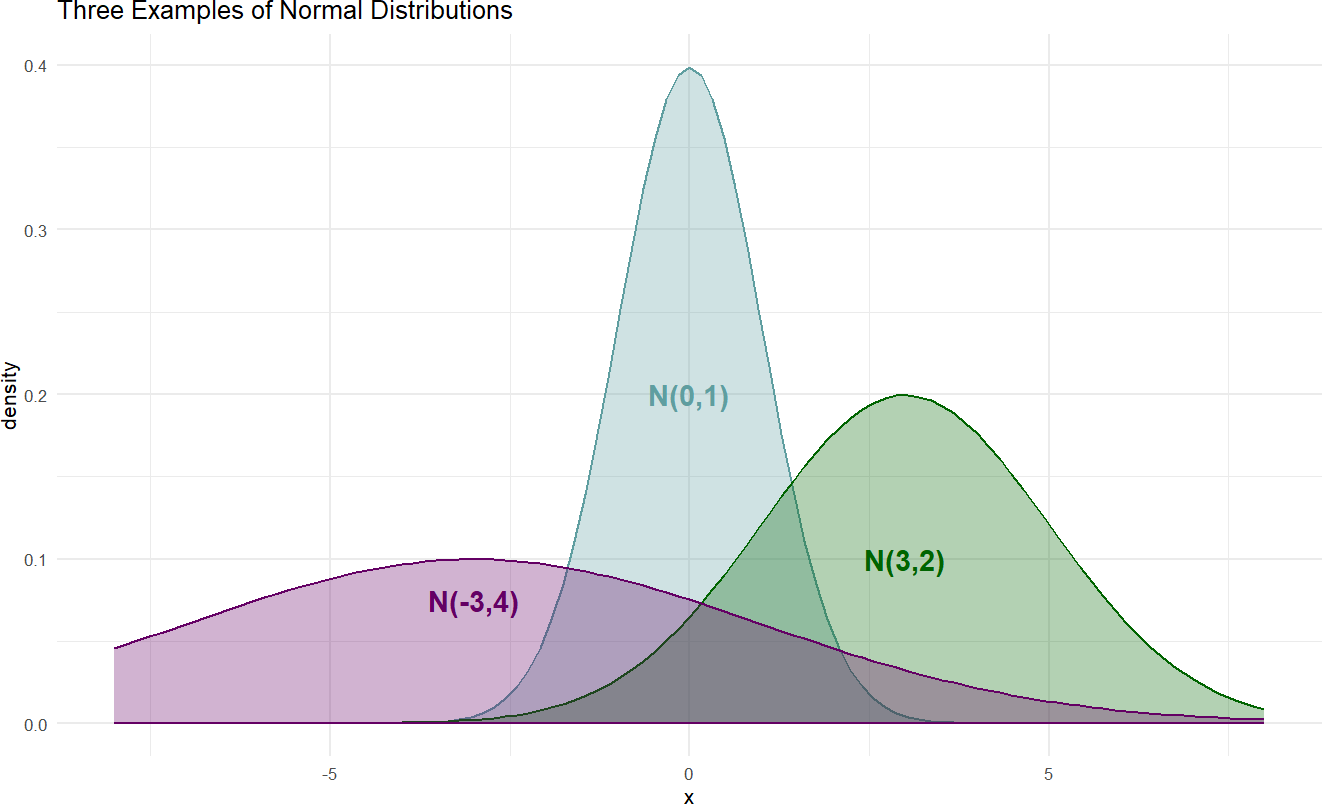
The densities of Figure 18.2 show the typical bell-shaped, symmetric curve, that we are used to. Since the
Figure 18.3: Simple model with Normal likelihood parametrized by mu and sigma with arbitrary priors for the parameters.
and the statistical model with priors:
where the prior distributions get determined based on the context of the problem under study.
For example, let’s say we are interested in modelling the heights of cherry trees.
Choosing a prior on
Hence, our statistical model becomes:
After choosing our prior, we then use data to reallocate plausibility over all our model parameters. There is a built-in dataset called trees,
## # A tibble: 31 × 3
##    Girth Height Volume
##    <dbl>  <dbl>  <dbl>
##  1   8.3     70   10.3
##  2   8.6     65   10.3
##  3   8.8     63   10.2
##  4  10.5     72   16.4
##  5  10.7     81   18.8
##  6  10.8     83   19.7
##  7  11       66   15.6
##  8  11       75   18.2
##  9  11.1     80   22.6
## 10  11.2     75   19.9
## # ℹ 21 more rows
which we will use in combination with the following generative DAG:
library(causact)

graph = dag_create() %>%
  dag_node("Tree Height","x",
           rhs = normal(mu,sigma),
           data = trees$Height) %>%
  dag_node("Avg Cherry Tree Height","mu",
           rhs = normal(50,24.5),
           child = "x") %>%
  dag_node("StdDev of Observed Height","sigma",
           rhs = uniform(0,50),
           child = "x") %>%
  dag_plate("Observation","i",
            nodeLabels = "x")

graph %>% dag_render()Figure 18.4: Observational model for cherry tree height.
Calling dag_numpyro(), we get our representative sample of the posterior distribution:
And then, plot the credible values which for our purposes is the 90% percentile interval of the representative sample:
Figure 18.5: Posterior distribution for the mean and standard deviation of cherry tree heights.
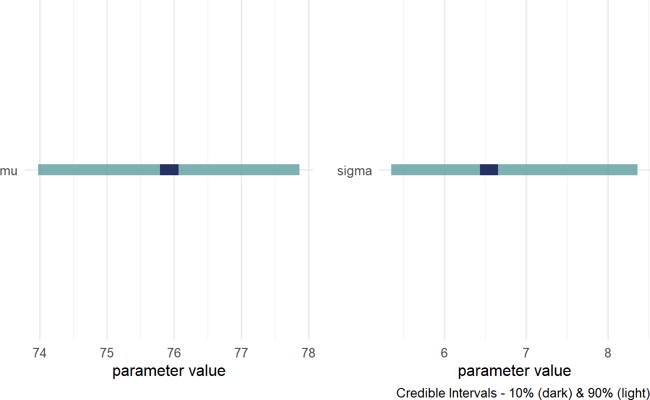
We now have insight as to the height of cherry trees as our prior uncertainty is significantly reduced. REMINDER: the posterior distribution for the average cherry tree height is no longer normally distributed and the standard deviation is no longer uniform. This is a reminder that prior distribution families do not restrict the shape of the posterior distribution. Instead of cherry tree heights averaging anywhere from 1 to 99 feet as accomodated by our prior, we now say (roughly speaking) the average height is somewhere in the 70-80 foot range. Instead of the variation in height of trees being plausibly as high as 50 feet, the height of any individual tree is most likely within 15 feet of the average height (i.e.
18.2 Gamma Distribution
The support of any random variable with a normal distribution is
More details for the
The causact expects these two parameters when using a
Figure 18.6: Example probability densities of the gamma distribution.
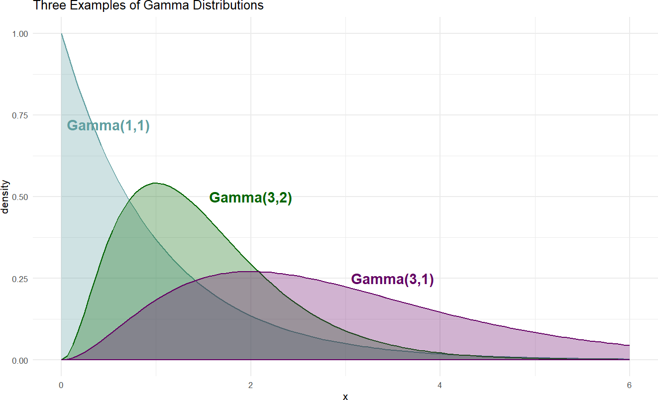
When choosing
The Gamma distribution is a superset of some other famous
distributions. The
These properties will be demonstrated when the gamma is called upon as a prior in subsequent sections.
18.3 Student t Distribution
For our purposes, the
The causact, is a three parameter distribution; notated
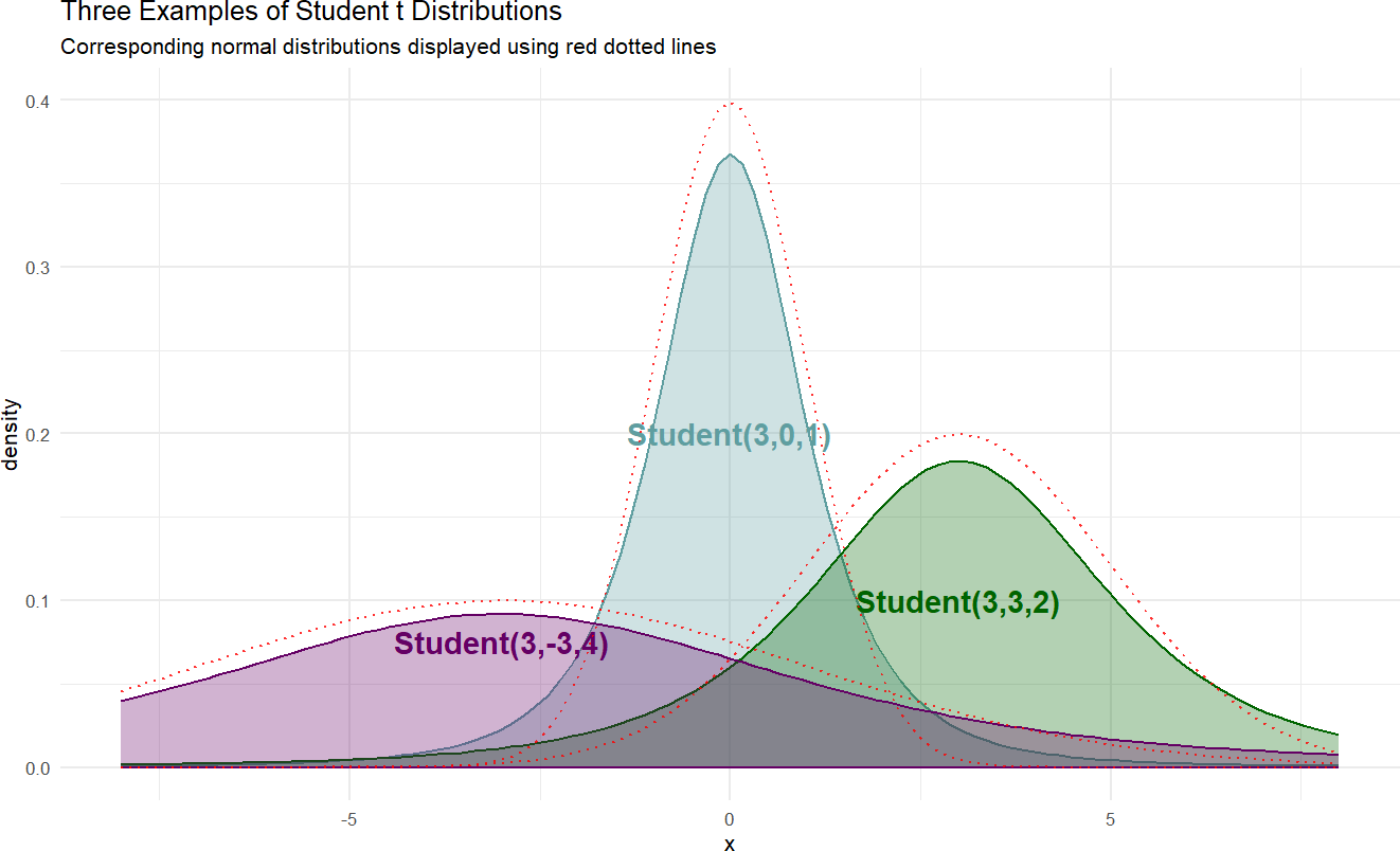
Here is a sample of three student-t distributions:
Figure 18.7: Example probability densities of the Student t distribution.
If we wanted to model the cherry tree heights using a
library(causact)

graph = dag_create() %>%
  dag_node("Tree Height","x",
           rhs = student(nu,mu,sigma),
           data = trees$Height) %>%
  dag_node("Degrees Of Freedom","nu",
           rhs = gamma(2,0.1),
           child = "x") %>%
  dag_node("Avg Cherry Tree Height","mu",
           rhs = normal(50,24.5),
           child = "x") %>%
  dag_node("StdDev of Observed Height","sigma",
           rhs = uniform(0,50),
           child = "x") %>%
  dag_plate("Observation","i",
            nodeLabels = "x")

graph %>% dag_render()Figure 18.8: Observational model for cherry tree height when observed tree height is assumed to follow a Student t distribution.
Calling dag_numpyro(), we get our representative sample of the posterior distribution:
And then, plot the credible values to observe very similar results to those using the
Figure 18.9: Posterior distribution for the mean, standard deviation, and degrees of freedom when modelling cherry tree heights.
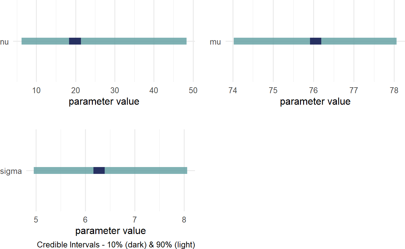
The wide distribution for
18.3.1 Robustness Of Student t Distribution
To highlight the robustness of the dataWithOutlier = c(trees$Height,1000)). Figure 18.10 shows recalculated posterior densities for both the normal and student t priors.
Figure 18.10: Estimates of a distributions central tendency can be made to downplay outliers by using a student t prior distribution for the mean.
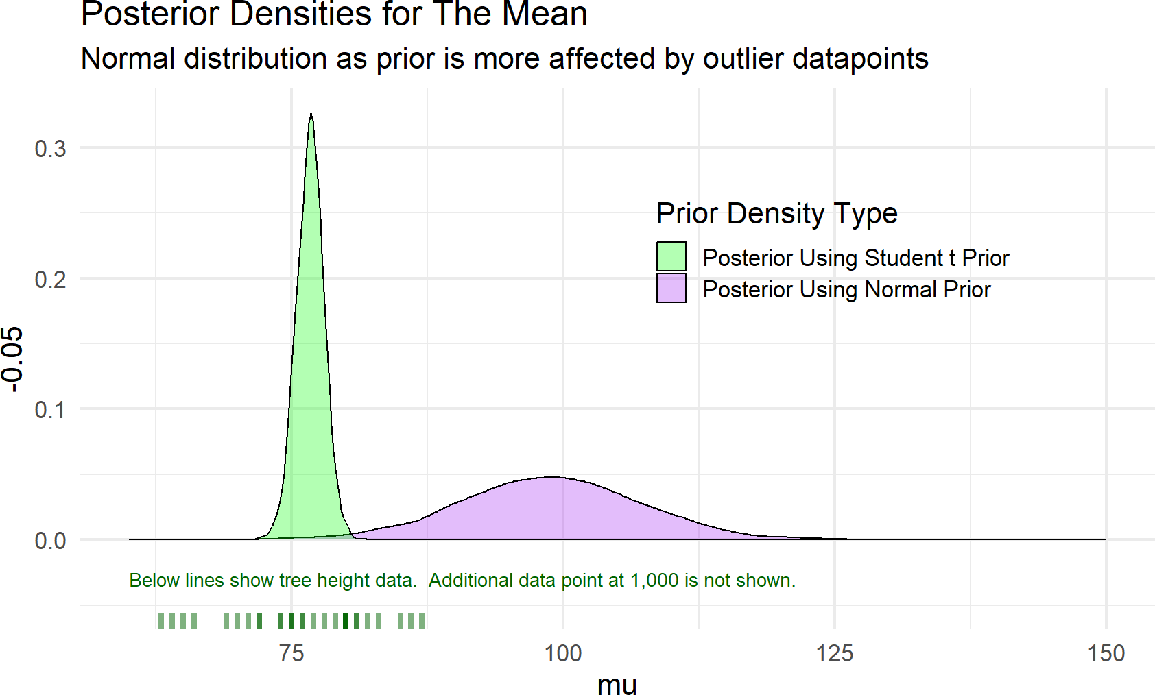
As seen in Figure 18.10, the posterior estimate of the mean when using a
18.4 Poisson Distribution
The Poisson distribution is useful for modelling the number of times an event occurs within a specified time interval. It is a one parameter distribution where if
Figure 18.11: Poisson data graphical model.
and a prior for ticketsDF dataset in the causact package.
There are several assumptions about Poisson random variables that
dictate the appropriateness of modelling counts using a Poisson random
variable. Three of those assumptions are: 1)
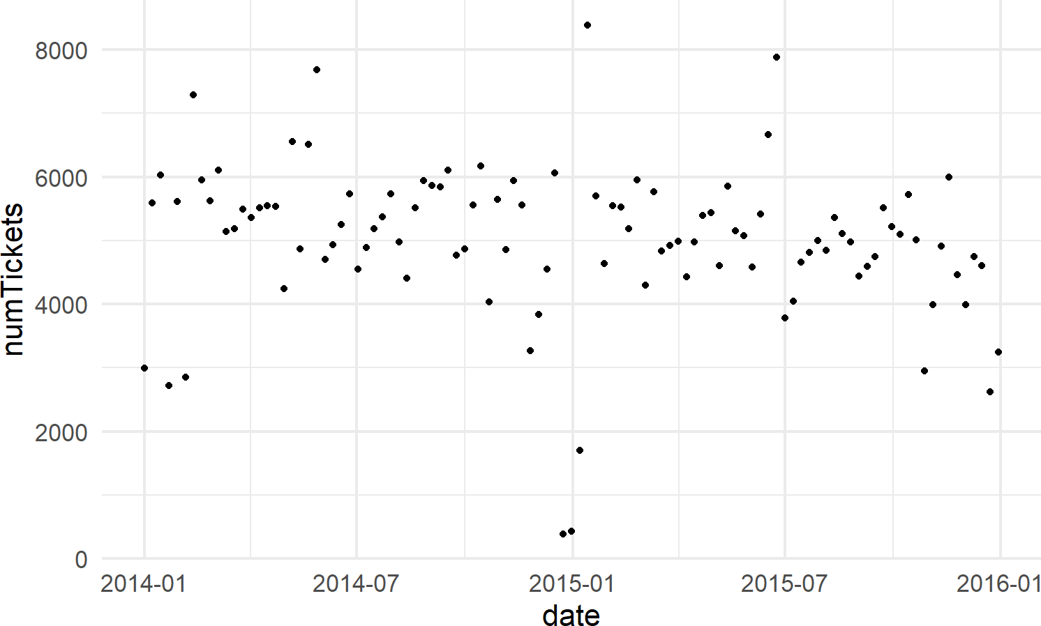
Let’s create a dataframe of tickets issued on Wednesday’s in New York City, and then model the rate of ticketing on Wednesdays using the Poisson likelihood with appropriate prior.
library(causact)
library(lubridate)
nycTicketsDF = ticketsDF

## summarize tickets for Wednesday
wedTicketsDF = nycTicketsDF %>%
  mutate(dayOfWeek = wday(date, label = TRUE)) %>%
  filter(dayOfWeek == "Wed") %>% ## note "=="
  group_by(date) %>% ## aggregate by date
  summarize(numTickets = sum(daily_tickets))

# visualize data
ggplot(wedTicketsDF, aes(x = date, y = numTickets)) +
  geom_point()
Figure 18.12: The number of daily traffic tickets issued in New York city from 2014-15.
Now, we model these two years of observations using a Poisson likelihood and a prior that reflects beliefs that the average number of tickets issued on any Wednesday in NYC is somewhere between 3,000 and 7,000; for simplicity, let’s choose a
graph = dag_create() %>%
  dag_node("Daily # of Tickets","k",
           rhs = poisson(rate),
           data = wedTicketsDF$numTickets) %>%
  dag_node("Avg # Daily Tickets","rate",
           rhs = uniform(3000,7000),
           child = "k")

graph %>% dag_render()Figure 18.13: A generative DAG for modelling the daily issuing of tickets on Wednesdays in New York city.
And extracting our posterior for the average rate of ticket issuance, rate in code instead of lambda due to the latter being a reserved word in Python that will cause issues with using dag_numpyro()), yields the following posterior:
Figure 18.14: Posterior density for uncertainty in the rate parameter.
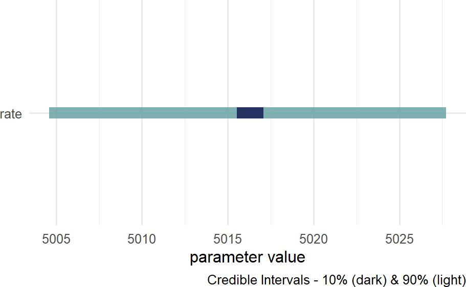
where we see that that the average rate of ticketing in NYC is somewhere slightly more than 5,000 tickets per day.
18.5 Exercises
Exercise 18.1 The following code downloads a 1-column dataframe containing 500 data points from a t-distribution. Your task is to recover the parameters of that t-distribution and use them to answer a question about the mean.
library(tidyverse)
tDF = readr::read_csv(
  file = "https://raw.githubusercontent.com/flyaflya/persuasive/main/estimateTheT.csv",
  show_col_types = FALSE)
Figure 18.15: Generative dag for a student t-distribution.
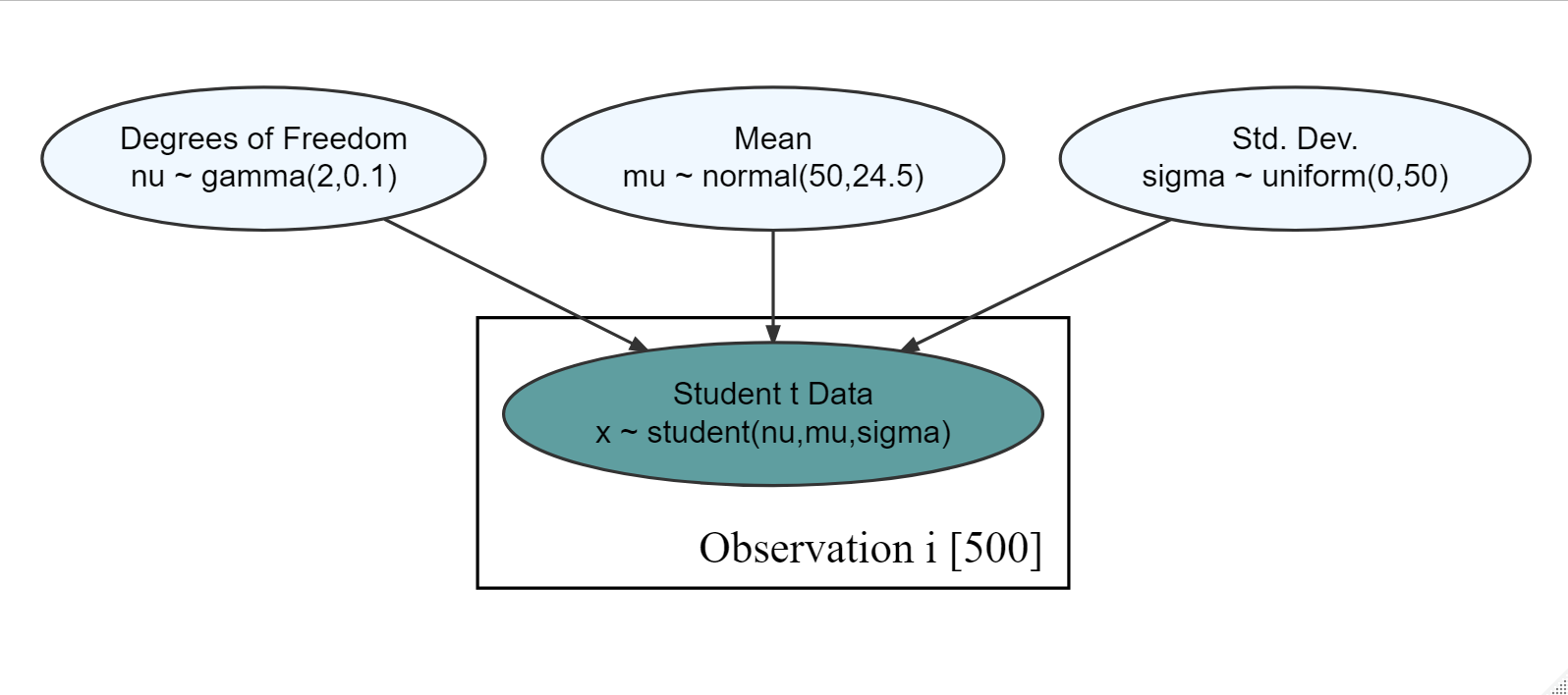
Based on the observational model in Figure 18.15 and the observed data in tDF, what is your posterior estimate that the mean (
Exercise 18.2 Based on the observational model in Figure 18.15 and the observed data in tDF from the previous exercise, what is your posterior estimate that the mean (
Exercise 18.3 The following code downloads a 12-column dataframe containing 891 data points of passengers on the Titanic; a vessel which sunk after hitting an iceberg. The following data description is helpful as these are the two columns of data you will use for this assignment.
pclass: A proxy for socio-economic status (SES) 1st = Upper 2nd = Middle 3rd = Lower
survive: 1=YES, 0 = NO
library(tidyverse)
tDF = readr::read_csv(
  file = "https://raw.githubusercontent.com/flyaflya/persuasive/main/titanic.csv",
  show_col_types = FALSE)
Figure 18.16: Generative dag for a student t-distribution.
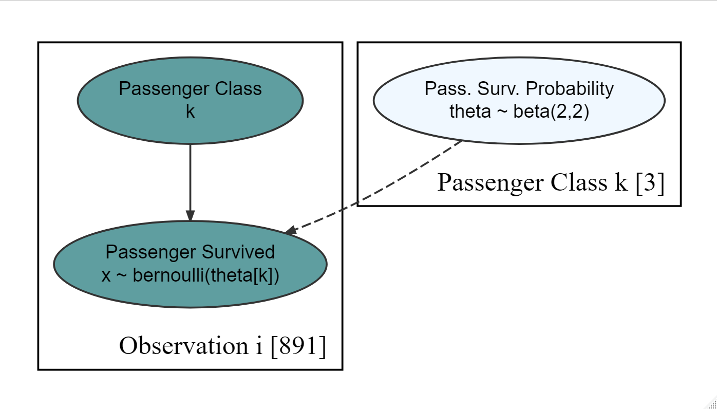
Using the generative DAG of Figure 18.16, estimate the probability that
Exercise 18.4 The following code will extract and plot the number of runs scored per game at the Colorado Rockies baseball field in the 2010-2014 baseball seasons.
Figure 18.17: Histogram of runs scored per game at the Colorado Rockies stadium.
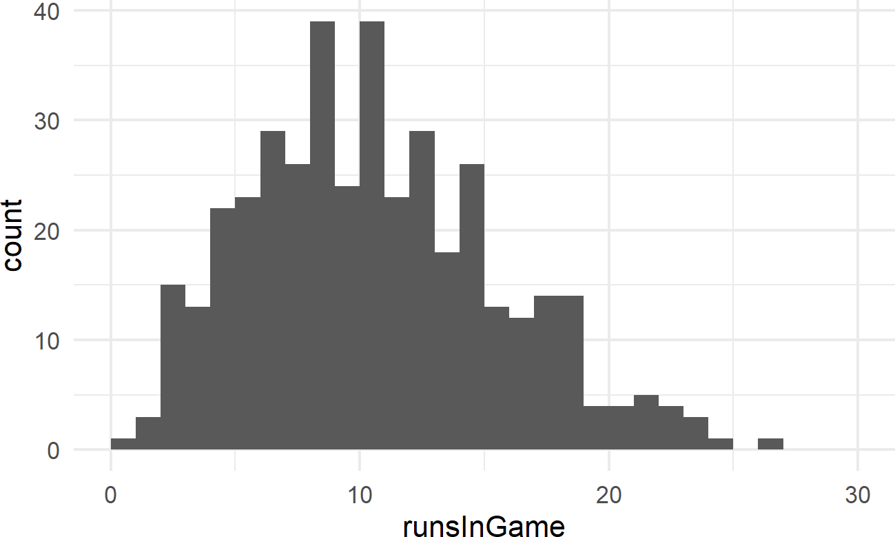
Runs scored per game is a good example of count data. And often, people will use a Poisson distribution to model this type of outcome in sports.
graph = dag_create() %>%
  dag_node("Avg. Runs Scored","rate",
           rhs = uniform(0,50)) %>%
  dag_node("Runs Scored","k",
           rhs = poisson(rate),
           data = baseDF$runsInGame) %>%
  dag_edge("rate","k") %>%
  dag_plate("Observation","i",
            nodeLabels = "k")
graph %>% dag_render()Figure 18.18: Generative dag for modeling runs scored as a Poisson random variable.
Using the generative DAG of Figure 18.18, what is the probability that the “true” average number of runs scored at Colorado’s Coors Field ballpark is at least 11 runs per game? (i.e.